
Olico
FMCG
Logo & Branding
A minimal identity inspired by nature, freshness, and the essence of the olive. For Olico, we created a clean and organic logo that captures the natural character of olive oil through a simple, expressive visual mark.
Summary
Olico is a natural olive oil brand built around the purity and character of one of nature's most valued ingredients. The brand required a visual identity that could communicate freshness, simplicity, and a connection to the natural world. Our logo and branding approach focused on creating a minimal identity that would feel clean and authentic rather than overly decorative. The objective was to give Olico a distinctive visual presence that could work effectively across bottles, packaging, labels, and other brand applications. The resulting identity combines a simple wordmark with an organic symbol to create a memorable and approachable olive oil brand.
Challenge
The client wanted a minimal logo with a creative use of an element associated with olives and nature. The challenge was to communicate the product category without relying on an obvious olive illustration or a complicated botanical symbol. Since the brand is centred around natural olive oil, the identity also needed to convey freshness and authenticity at first glance. The logo had to remain simple enough to reproduce clearly across packaging and small-format applications while still having enough character to stand out on a retail shelf. Finding the right balance between minimalism, natural cues, and brand distinctiveness was the core design challenge.
Solutions
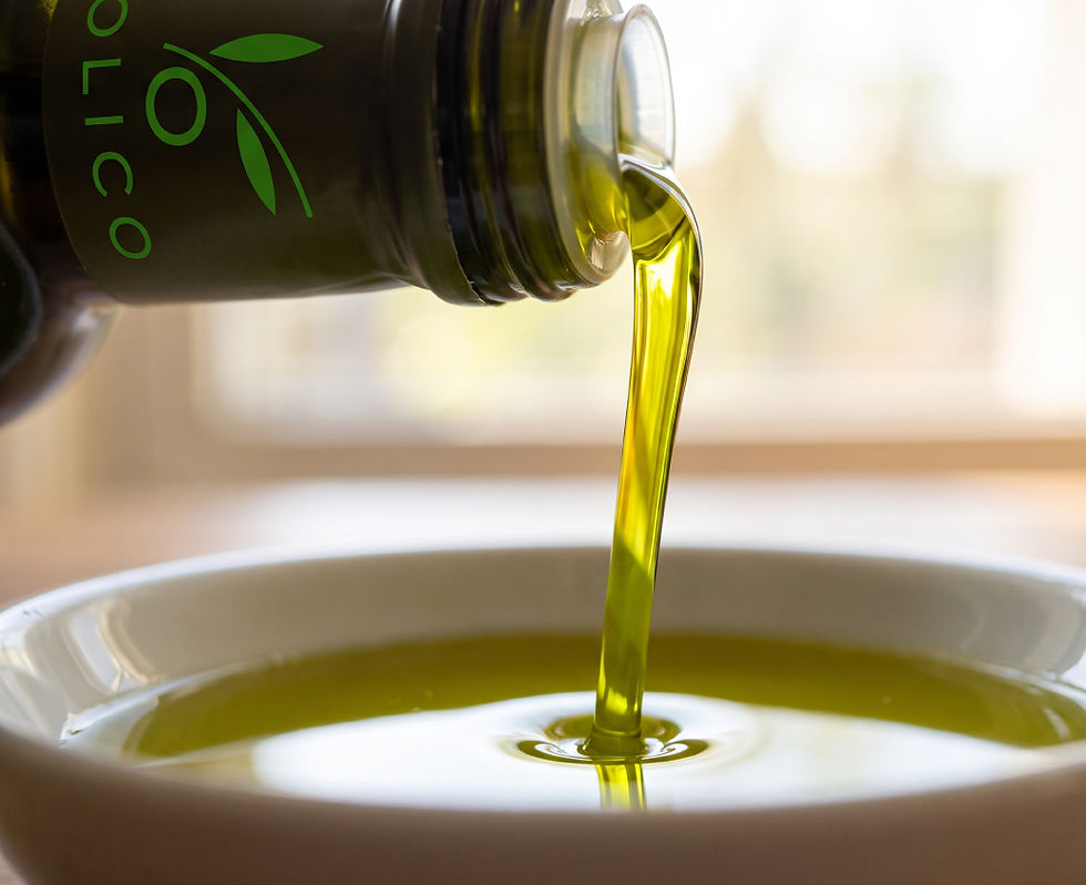
We created a custom organic symbol by combining a flowing stem, leaves, and a circular form that subtly references an olive. The curved stem gives the mark a natural sense of movement, while the simple leaf forms reinforce Olico's connection with freshness and nature. Rather than illustrating an olive literally, we reduced the elements to clean, recognisable shapes, giving the identity a contemporary and sophisticated feel. The fresh green colour strengthens the association with olives, natural ingredients, and purity while giving the brand a distinctive presence. Paired with a simple lowercase wordmark, the final identity creates a clean and versatile branding system suited to olive oil packaging, labels, digital communication, and other brand touchpoints.


Naming . Identity . Logo . Packaging . Positioning