
Live Green
FMCG
Logo & Branding
Product Packaging
Its pure, wholesome nutrition with Live Green, a premium raw honey brand brought to life through strategic logo & branding and charming jar packaging design.
Summary
Live Green entered the competitive FMCG natural foods market with a wholesome mission: to deliver pure, unprocessed raw honey straight from nature while promoting sustainable beekeeping practices. Our team was entrusted with crafting the comprehensive logo & branding alongside a specialized, eye-catching jar packaging design tailored specifically for their raw honey line. The overarching objective was to establish an identity rooted in environmental friendliness, natural purity, and rustic charm. By blending playful illustration with clean product presentation, we built a cohesive brand presence that stands out warmly on natural food shelves.
Challenge
The natural honey market is frequently crowded with generic, overly clinical labels or dull packaging that fails to convey the authentic, farm-fresh origin of the product. For Live Green, the challenge was to create a warm, inviting jar layout that clearly highlights the raw, multi-floral benefits of the honey without looking cluttered or messy. The client specifically requested a premium packaging design that emphasizes an eco-conscious, natural touch featuring charming beekeeping illustrations and clear quality highlights. Balancing this illustrative, story-driven style with a legible nutritional and regulatory layout on a curved container format required meticulous spatial planning.
Solutions
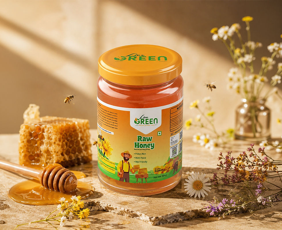
We solved this design and packaging problem by developing a vibrant visual structure anchored in sunny golden tones, earthy greens, and crisp white label panels. The front of the jar features a cheerful beekeeper illustration surrounded by blooming sunflowers and beehives, paired with bold typography for the "Live Green" brand and "Raw Honey" designation. The label is cleanly complemented by a matching golden-orange lid bearing the brand logo, alongside concise benefit callouts like "Pollen Rich," "Multi Floral," and "Bee Friendly." This thoughtful design approach successfully transformed an everyday natural staple into an engaging, premium pantry favorite.


Naming . Identity . Logo . Packaging . Positioning