
Indilever
Retail
Logo & Branding
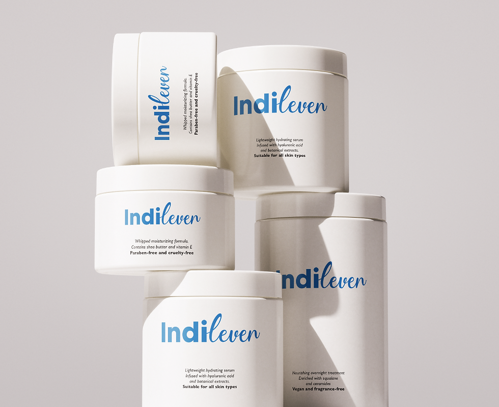
A clean, confident identity designed for a modern consumer brand. For Indilever, we created a simple wordmark-led identity that combines a professional presence with a subtle sense of approachability and movement.
Summary
Indilever is a consumer packaged goods (CPG) company building a brand presence for products designed for everyday consumers. The project included logo and branding, brand collateral design, and sample packaging, creating a consistent visual foundation across multiple touchpoints. The client wanted a simple, clean, and minimal wordmark that could establish recognition without relying on a complicated symbol. We developed the identity around the name itself, using a single-tone blue colour to create a clear and unified visual language. The result was designed to provide Indilever with a flexible identity that can work effectively across packaging, communication, and future product extensions.
Challenge
The key challenge was creating a distinctive identity from a relatively simple wordmark while ensuring it could represent a broad consumer goods portfolio. Since CPG brands often compete directly for attention on crowded shelves, the logo needed to be recognisable without becoming visually complicated. The single-tone colour requirement meant that typography and lettering had to carry much of the brand's personality. We also needed to ensure the identity could transition naturally from the primary logo to packaging and brand collateral without losing its simplicity. Most importantly, the design needed to feel established and trustworthy while leaving enough flexibility for the brand to grow across different product categories.
Solutions
We focused on a typography-first branding approach, making the Indilever name the central visual asset of the identity. The wordmark combines a strong, clean letterform structure with a more expressive handwritten treatment, creating a balance between professionalism and a human, approachable character. A single-tone blue palette gives the brand a consistent and dependable appearance while allowing the logo to remain versatile across different applications. We extended the same visual language into brand collateral and sample packaging to demonstrate how the identity could work as a complete brand system. The outcome is a simple, distinctive, and scalable visual identity built to support Indilever as it develops its presence in the consumer packaged goods market.


Naming . Identity . Logo . Packaging . Positioning