
Caretrip
Travel
Logo & Banding
Caretrip is a global travel brand built around making business journeys easier, smoother, and more dependable. The identity was created to combine the feeling of travel with a clear sense of care, trust, and professional support.
Summary
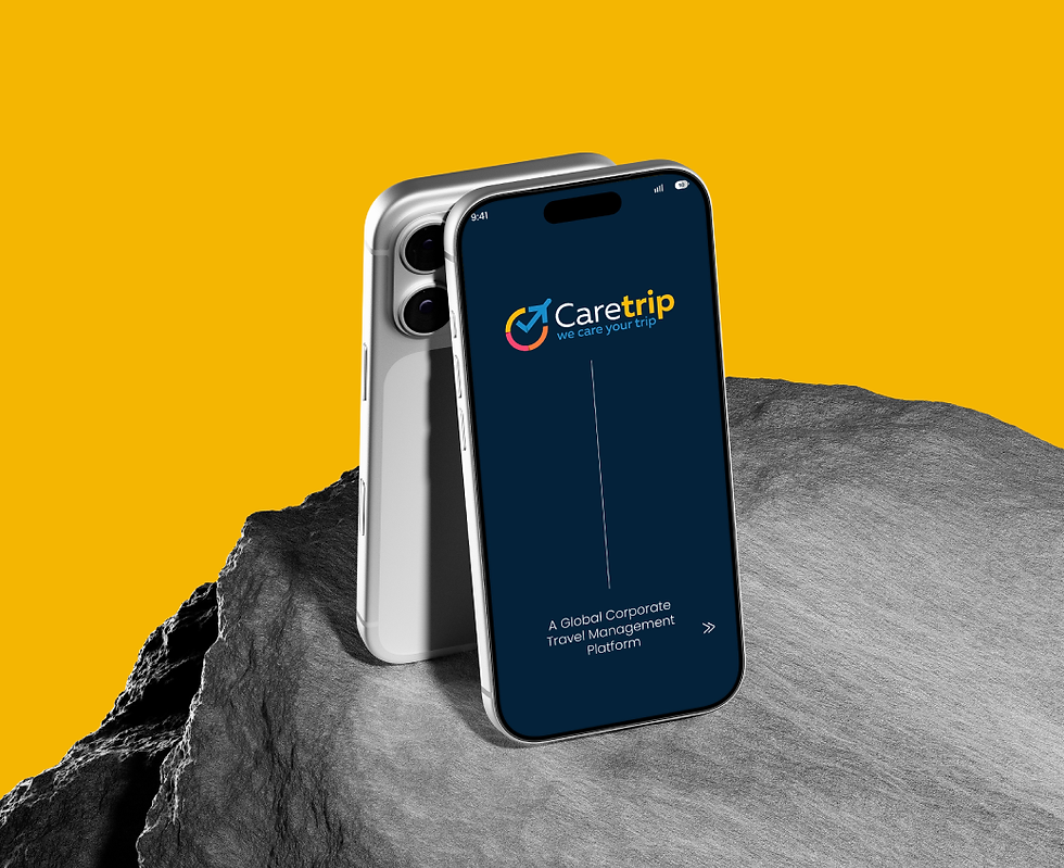
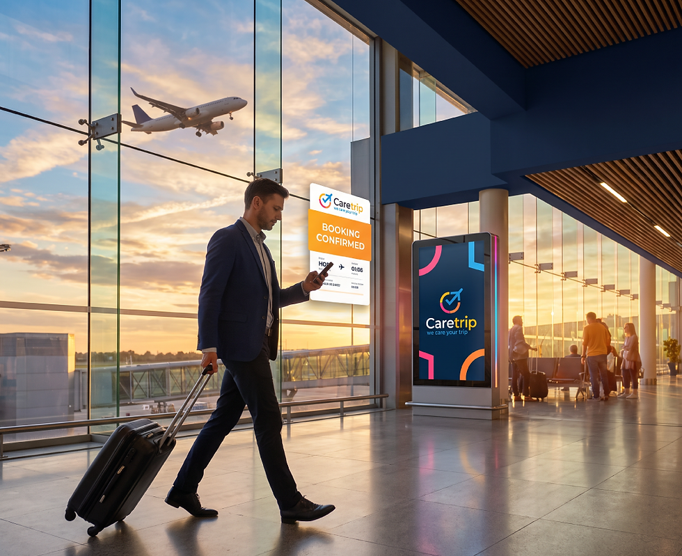
Caretrip approached us to create an iconic logo that could represent its corporate travel-focused approach in a simple and meaningful way. The idea was to build a visual mark that connects naturally with travel while also reflecting the brand’s promise of taking care of every journey. We developed an icon by bringing together familiar travel and navigation cues with a check-mark form, creating a sense of movement and assurance. The circular structure adds a feeling of continuity and completeness, making the symbol easy to recognise and remember. The blue, orange, and pink colour combination gives the identity an energetic and welcoming personality while helping the different elements stand apart. The same visual language was extended into the brand materials to create a consistent identity across different customer touchpoints.
Challenge
The main challenge was to create an industry-relevant symbol without making the logo look like a typical travel company identity. The mark needed to communicate travel and movement while also expressing the idea of care, reliability, and a well-managed journey. Since Caretrip operates in the corporate travel space, the identity had to feel professional enough for business users while remaining friendly and approachable.
Another challenge was combining multiple visual ideas into one icon without making the design appear crowded or difficult to understand. The colour palette also needed to feel energetic and global while maintaining a sense of trust and clarity. The goal was to create a logo that could be understood quickly and remain memorable across both digital and physical applications.
Solutions
We created a distinctive icon-based logo by combining travel-related visual cues with a check mark, representing a journey that is planned, managed, and taken care of. The circular form adds a sense of movement and connection, while the check element gives the symbol a clear feeling of confidence and completion. A combination of blue, orange, and pink brings energy to the identity and helps Caretrip stand apart from more conventional corporate travel brands. The wordmark was kept clean and easy to read, allowing the icon and brand name to work together as a strong visual unit. We carried these elements into the brand materials to ensure that every communication feels connected to the same identity. The final branding gives Caretrip a professional yet approachable presence, helping the brand communicate trust and a smoother travel experience at first glance.


Naming . Identity . Logo . Packaging . Positioning