
B for Black
Fashion & Clothing
Logo & Branding
Brand Communication
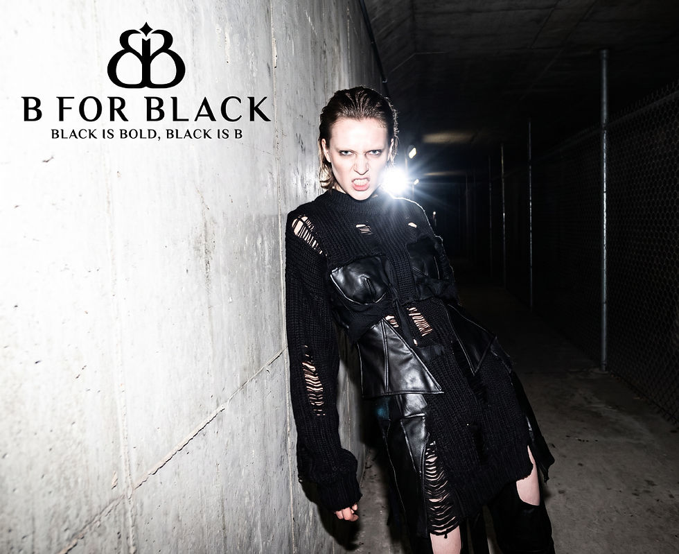
A bold identity created for a generation that sees fashion as a form of self-expression. For B for Black, we developed a distinctive visual identity that reflects the confidence, individuality, and fast-moving nature of Gen Z fashion.
Summary
B for Black is a Gen Z fast fashion brand built around contemporary style, individuality, and bold self-expression. The project focused on creating a logo and brand identity that could give the brand a strong and recognisable presence in the fashion market. The client specifically requested an initial-based logo design, making the letter “B” the central element of the visual identity. We developed a custom monogram that gives the initial a distinctive and fashion-forward character while maintaining a clean overall appearance. The black-and-white colour palette was chosen to create a timeless, bold, and versatile identity that can adapt easily across fashion collections and future brand applications.
Challenge
The main challenge was creating an initial-based logo that felt distinctive enough to become a recognisable fashion symbol. Since the letter “B” is widely used across different brands, the design needed to move beyond a standard typographic treatment and develop its own visual personality. The identity also needed to connect with a young, trend-conscious Gen Z audience without becoming overly temporary or dependent on short-lived fashion trends. Working exclusively with black and white meant the design had to create impact through form, balance, and structure. We also needed to ensure that the logo could work equally well as a standalone monogram, a full brand name, and across different fashion-related touchpoints.
Solutions
We created a custom B-based monogram that transforms the initial into a bold and distinctive visual symbol for the brand. The flowing and symmetrical structure gives the mark a strong sense of individuality while allowing it to feel premium, modern, and memorable. The clean “B FOR BLACK” wordmark complements the monogram with a refined typographic style that adds confidence and versatility to the identity. By using a monochrome black-and-white palette, we created a visual system that remains timeless and works effortlessly across apparel, labels, packaging, and digital platforms. The final identity gives B for Black a strong, fashion-forward, and recognisable brand presence designed to connect with the energy and self-expression of Gen Z fashion.



Naming . Identity . Logo . Packaging . Positioning