
Asnuva
Astrology
Logo & Branding
Brand Communication
A distinctive identity rooted in spirituality, authenticity, and timeless symbolism. For Asnuva, we created a refined brand identity that transforms the powerful symbolism of the Trishul into a contemporary visual language for a modern spiritual and wellness brand.
Summary
Asnuva is a spiritual and wellness brand offering authentic products inspired by astrology, Vastu, occult sciences, and traditional spiritual practices. The brand brings together genuine gemstones, certified Rudrakshas, spiritual jewellery, crystals, pyramids, idols, and puja essentials under one identity. Our work focused on developing the logo and brand communication around the idea of authenticity, spiritual energy, and trust. The identity needed to feel rooted in tradition while remaining distinctive and relevant to today's audience. We developed a minimal, single-colour visual system that gives Asnuva a strong and memorable presence across its brand touchpoints.
Challenge
The key challenge was to create a Trishul-inspired logo without falling into the familiar visual language of generic trident symbols commonly associated with spiritual brands. Asnuva needed a mark that could communicate spirituality and power while still feeling original and ownable. The logo also had to work effectively in a single colour, making its form, balance, and symbolism especially important. Another consideration was creating an identity that could represent a diverse range of spiritual and wellness products without becoming overly complicated or decorative. The challenge was ultimately to find the right balance between traditional symbolism, modern aesthetics, and brand differentiation.
Solutions
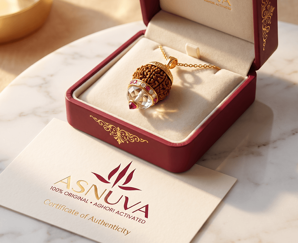
We approached the identity by reinterpreting the Trishul through a more fluid and distinctive geometric form rather than reproducing a conventional trident. The three upward elements create a strong spiritual association, while the central form gives the symbol a sense of focus, energy, and elevation. Carefully balanced curves and sharp points bring together a feeling of movement and stability, helping the mark stand apart from typical spiritual logos. A single deep maroon tone was used to create a sophisticated and consistent visual presence across applications. Alongside the logo, we developed brand communication that reinforces Asnuva's positioning around authenticity, spiritual knowledge, and carefully selected spiritual products.


Naming . Identity . Logo . Packaging . Positioning